Eric Gilbert, principal of Scott + Reid General Contractors, talked to Invest: Dallas-Fort Worth about the ongo...
Read MoreCreating a Branded Office Experience
Creating a truly seamless experience for customers and clients often means making sure the same values, design, and aesthetics are present in your services, digital channels, and marketing materials, as well as in the environments and offices you occupy.
Implementing company branding into office spaces also creates positive synergy for employees – keeping them visually connected through physical touchpoints and the overall atmosphere. Scott + Reid has been privileged to bring many branded public and private spaces to life for our clients. We excel at teaming with the architect and design firms to execute their creative vision for a total brand experience.
Ways to Consider Brand Incorporation In A Public or Private Office:
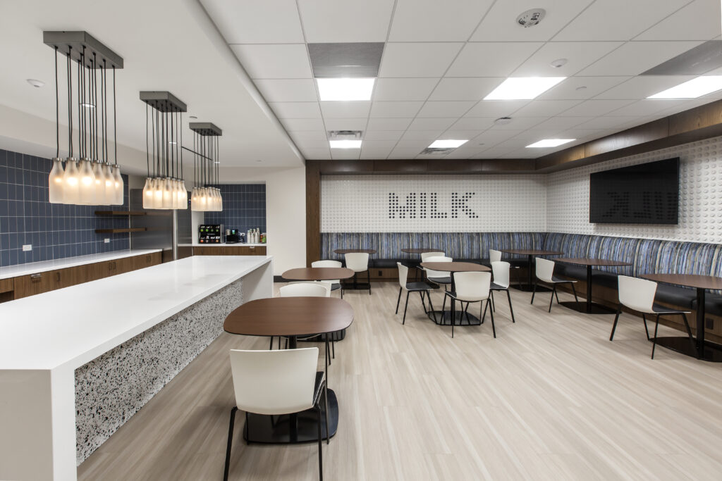 For Dairy Farmers of America, this tiled MILK wall brought company recognition to the break room.
Architect: Entos Design
Logo Walls, Murals, Slogans, & Mottos:
The most traditional way branding is incorporated into a space starts with a logo wall at the interior entrance, lobby, or other communal spaces. Outside of a standard logo or sign, our clients have included artful representations of their logos via mosaic or tile work and incorporated slogans and mottos in community spaces.
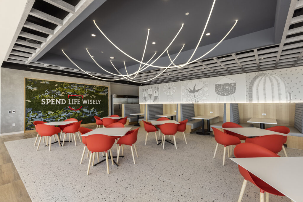 The First United Bank motto “Spend Life Wisely” was artfully featured in the lounge space.
Architect: Entos Design
Color Choices:
When it comes to colors and finishes, palettes can be subtle or straightforward. Some of our clients tend to incorporate their colors through trim work, fabrics, furnishings and other soft touches. Others will boldly paint rooms, choose tilework or stone in company colors, or even install neon lighting accents to really make a statement.
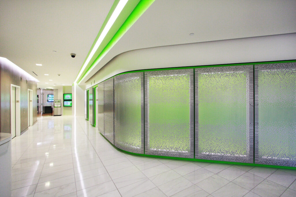 Interstate Batteries chose to accentuate this hall boldly with branded neon green lighting.
Architect: HOK
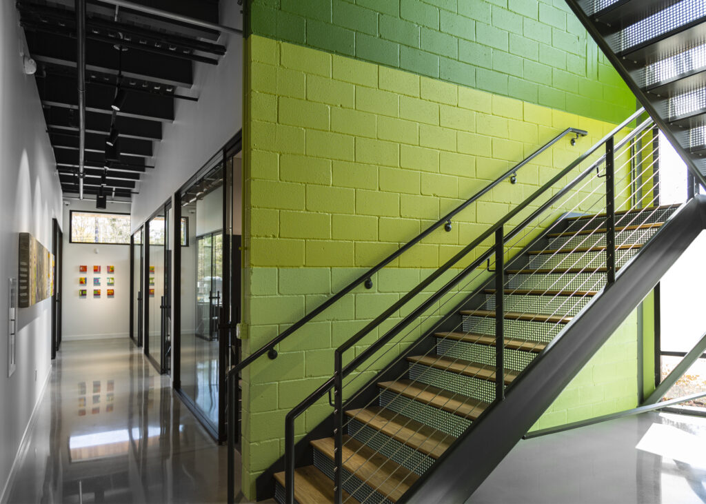 This stairwell at Scott + Reid headquarters was painted in our signature shades of green.
Architect: Studio Meyer
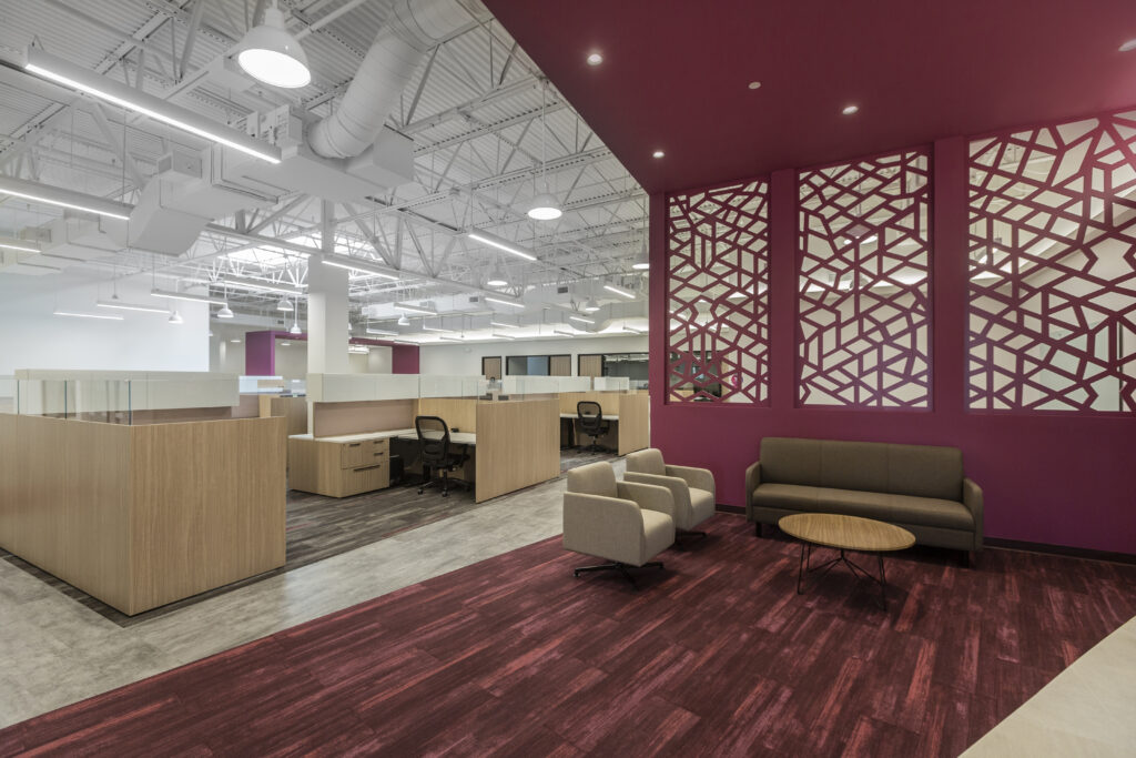
The Ribbon Communications buildout included a “ribbon” of their brand standard purple that starts in the entry and continues from the carpet to the walls and to the ceiling, creating a cohesive feel through the suite.
Architect: IA Interior Architects
Style & Finishes:
Whether a company is modern or more traditional, style and finishes can also communicate company culture. For more traditional companies, we’ve found the incorporation of natural wood finishes and marble to be common. For more modern companies, clients opt for stainless steel and tech-forward gathering spaces. We’ve also found companies to incorporate their branding through custom ceiling features as TBK Bank and Patron Spirits did.
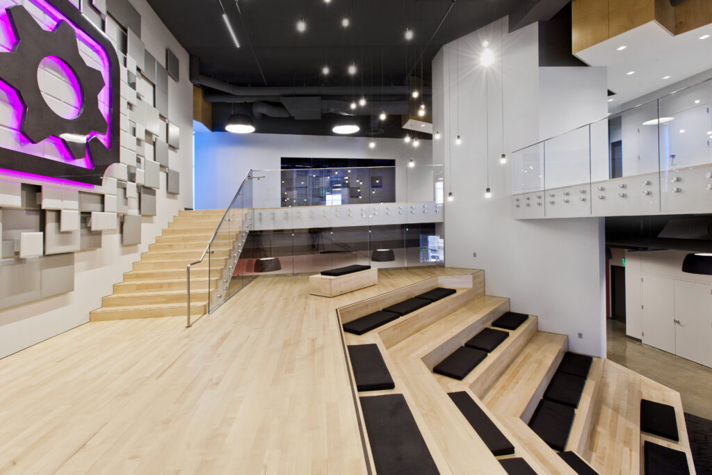
Gearbox Software includes their logo on a wall as well a modern shape and style to the entire room in a very tech-forward style.
Architect: Page/
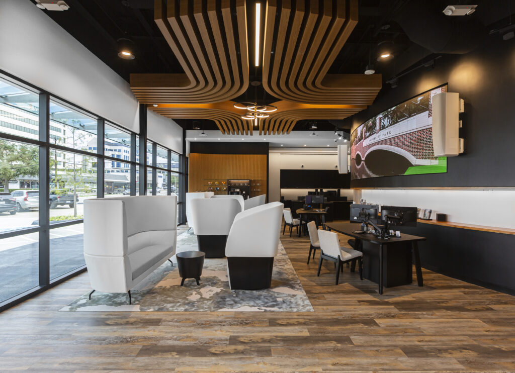 The corporate logo for TBK is subtly displayed through a custom wood ceiling installation.
Interior Architect: Abel Design Group
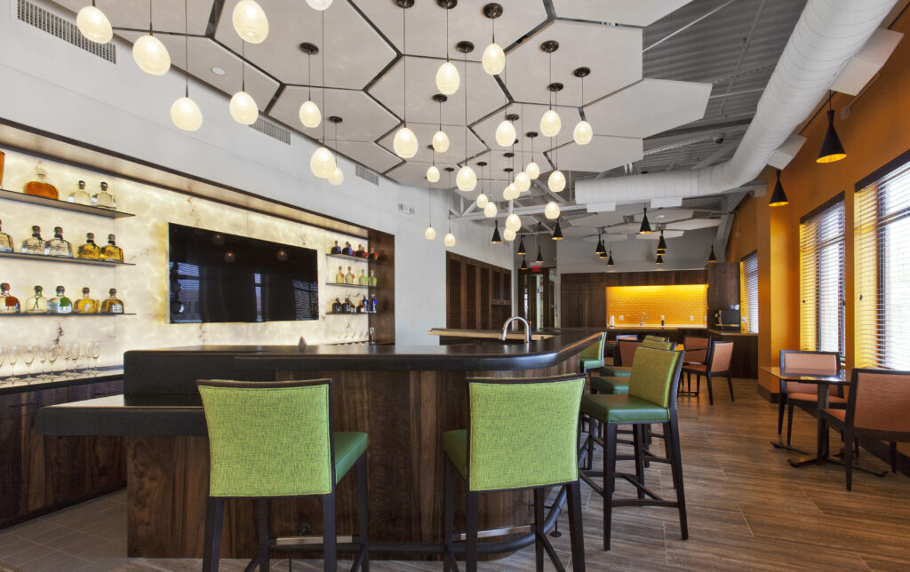 The hexagonal ceiling tiles at The Patron Spirits Company are a nod to the bee in their logo.
Architect: Staffelbach
Art:
Art is a wonderful way to tell your story and share what’s important to you and your company. Whether it’s interior or exterior sculptures, custom art pieces, or other creative installations, art is a way to reinforce what’s essential to your internal and external company cultures.
As we deeply value each one of our employees and what they bring to our team, at Scott + Reid headquarters, we asked all of our employees to choose a single object that represented them. The result was a custom art piece that individually highlights our team members while creating one cohesive installation.
If you are looking for ways to incorporate branding into your existing office or trying to imagine something new, we’d love to speak with you about your project.
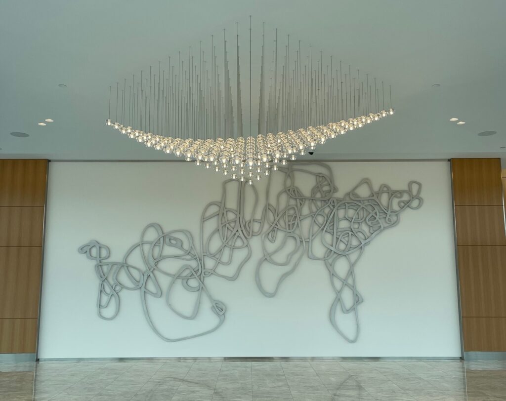 This installation gives a modern and fluid feel to a traditional space with a custom light fixture in the shape of the Lincoln Centre logo.
Architect: Entos Design
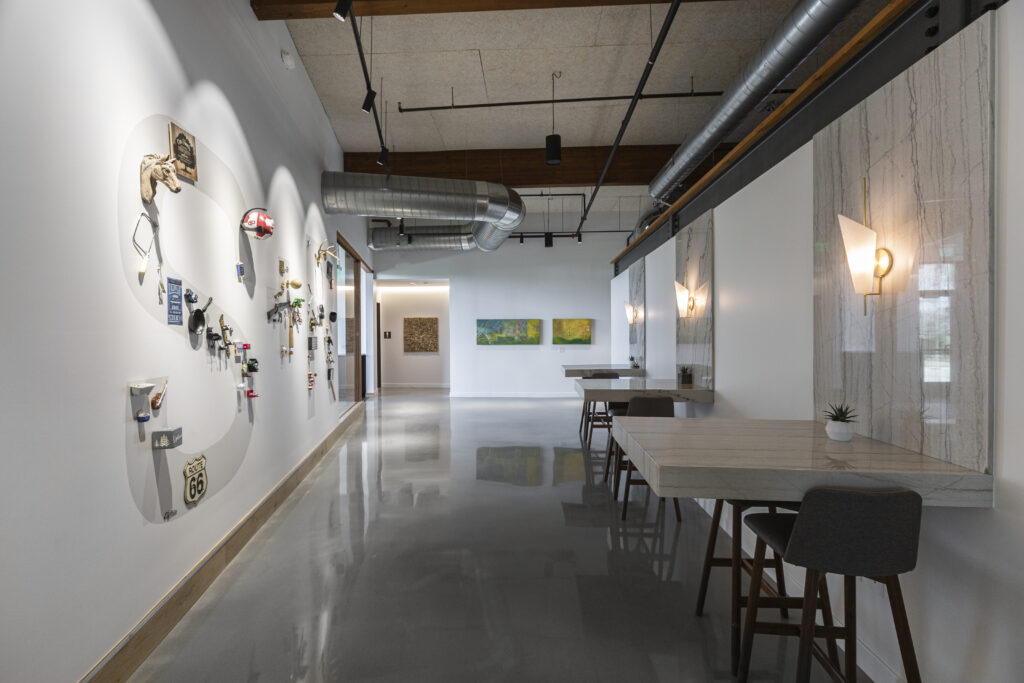 This art installation at the Scott + Reid Dallas headquarters is individual objects that represent each employee inside a custom S+R mural.
Architect: Studio Meyer


